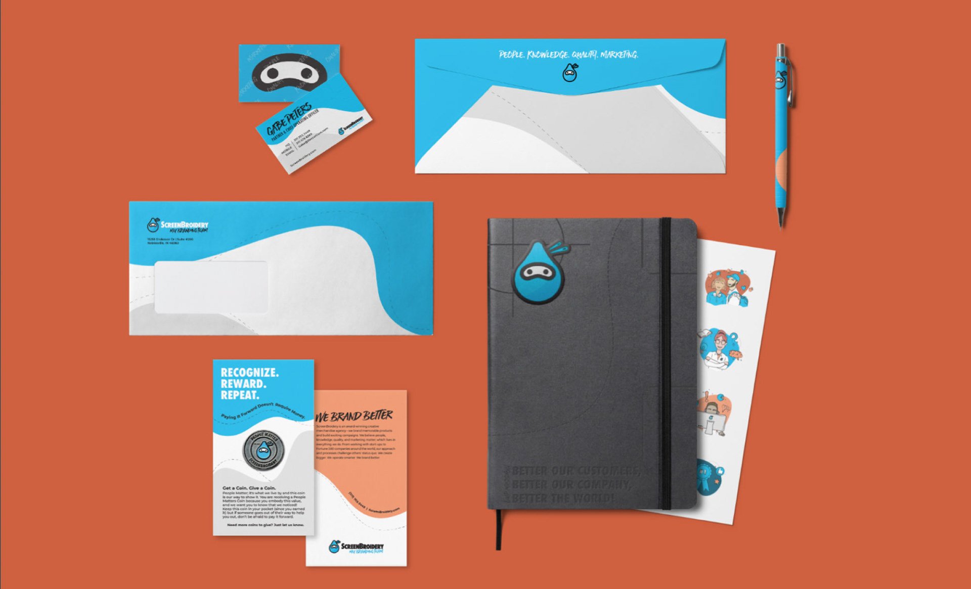
ScreenBroidery Identity System
Upon joining the ScreenBroidery team in 2015, I was introduced to the business model of a fast-growing promotional company that aspired to work around a centralized hub with a forecast of dozens of brick-and-mortar stores that would acquire walk-ins as well as local business orders. The walk-ins would be handled on-site with digital screen printing or a single head embroidery machine, while larger orders would filter to ScreenBroidery’s hub, where they would be mass-produced to ensure fast turnaround times and cost-effective solutions.
That being said, ScreenBroidery has always operated as a start-up model, allowing for quick transitions as industry and customer needs evolve. The company quickly excelled in creating eCommerce solutions that saved Human Resources, Marketers, and Sales Reps time and money. These systems are built to fulfill all branded material needs to save time, money, and maintain brand standards.
While the eCommerce sector of the company continued to grow - the brick-and-mortar model did not. This posed an identity crisis, as the previous designer had created a logo that represented the coming of two print methods into one store - screen printing + embroidery. The logo featured the word mark combination of 'Screen' & 'Broidery' to form ScreenBroidery with an underline stemming off of the letter ‘y’. The right half of the line being a dash & the left side being dots (often used in screen printing) or lines (embroidery stitches).
This created a false perception of who ScreenBroidery is and where they were headed. The brick-and-mortar style marketing had to be re-evaluated & the revamp needed to happen.
The deep dive to transition the branding while informing but not confusing current clients began.
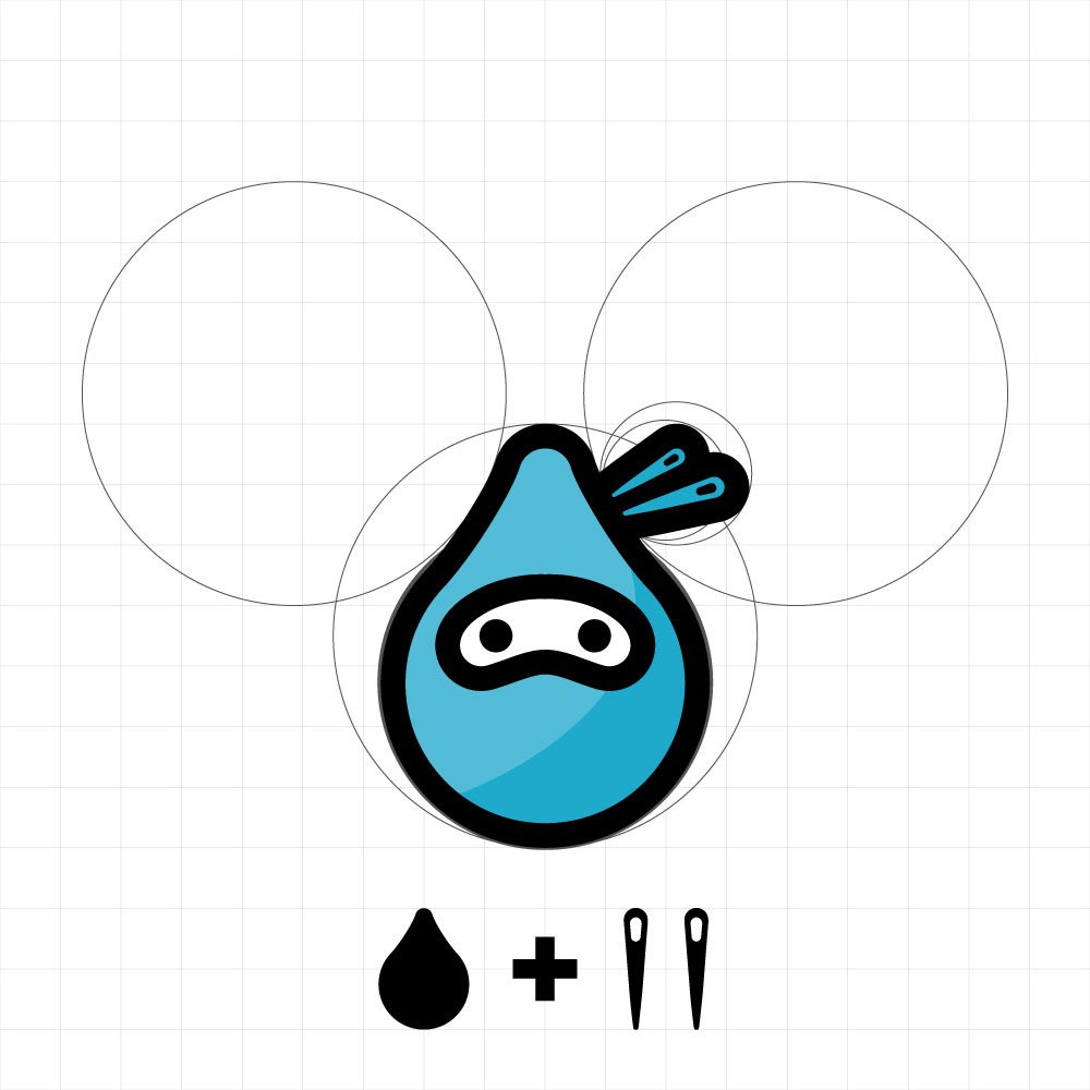
ScreenBroidery was not ready for a name change, therefore the focus became around the icon itself. The icon pays homage to the original thought of the company (screen printing + embroidery). It is the simplistic combination of two embroidery needles meeting a drop of ink to form a friendly ninja head, or who we like to call, Swaggie. The simple yet unique icon became the perfect representation of ScreenBroidery, allowing people to familiarize themselves with the brand and easily identify the company.
Icon Breakdown
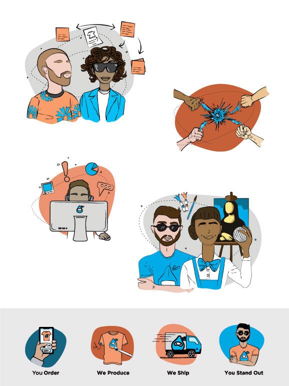
The apparel and promotional industry often time lacks progression, which ScreenBroidery has always aimed to combat with new ways of thinking. With character branding becoming an increasingly popular and effective means of informative illustration, I sought out a way to introduce it into the brand’s identity. It was my goal to display company culture while simultaneously complimenting newly written services.
Exploring this became a no brainer as it solved a few major issues:
1. Explained complicated workflow processes in a simplified graphic breakdown.
2. Developed a unique that made ScreenBroidery even easier to identify
3. Elevated the ScreenBroidery brand identity from their antiquated competitors.
Once the lightbulb turned on, the discovery and ideation process was in full swing. While most companies wanted to maintain an easily replicated character by using basic shapes, I found it important to go the extra mile and hand-draw the characters to further separate ourselves from the competition.
I sought out a hand-skilled designer and illustrator to assist me in discovering the identity of our character. We concluded that by leaving off the character's nose and eyes we were able to create a uniquely identifiable style that helped us tell our story.
Character Branding
Packaging
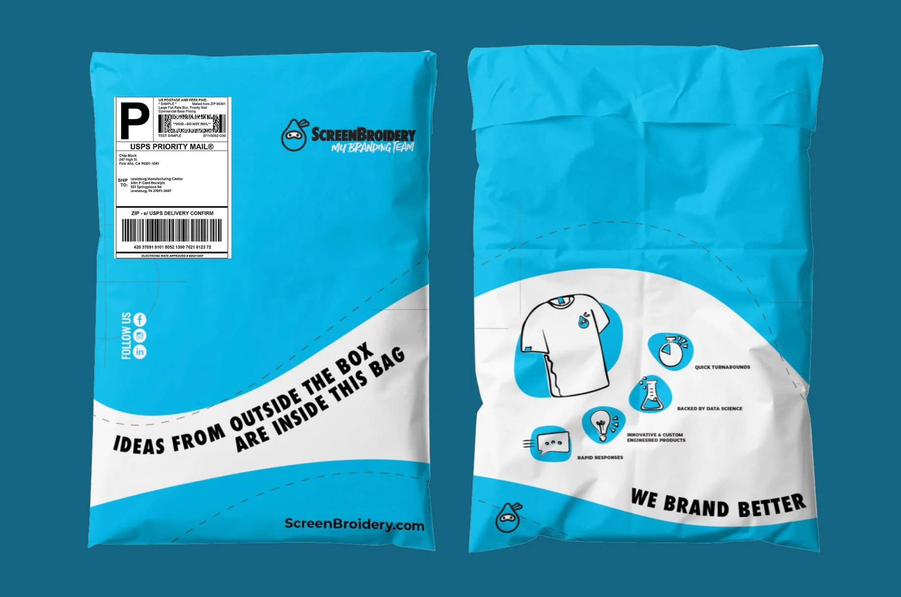
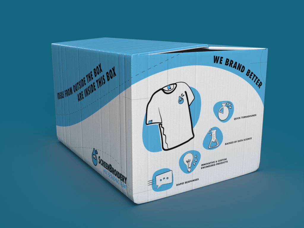
With ScreenBroidery driving such success with eCommerce - the touchpoints with the customer became critical. With every customer purchase, one thing is guaranteed - the customer will receive a package. That package represents an expectation. If an order arrives in a typical brown box, the product inside will be perceived as dull or commonplace. If it arrives in a fully custom, colorful box designed with presentation in mind, the valued perception of what is in that box just increased ten-fold along with their order experience.
While this task is inherently simple, the design was significant. The box needed to be bright, it needed to have a message, and it needed to be the initial representation of our identity system. Meaning, it needed to be able to translate across different marketing pieces.
Working with our in-house designer, we developed and expanded our identity into packaging. The specifications I listed were as follows:
* Needed to have a bold statement “Ideas From Outside Of The Box Are Inside This Box.”
* Needed to list out the benefits of working with our company
* Display our iconic logo loud and proud
* Represent our brand identity
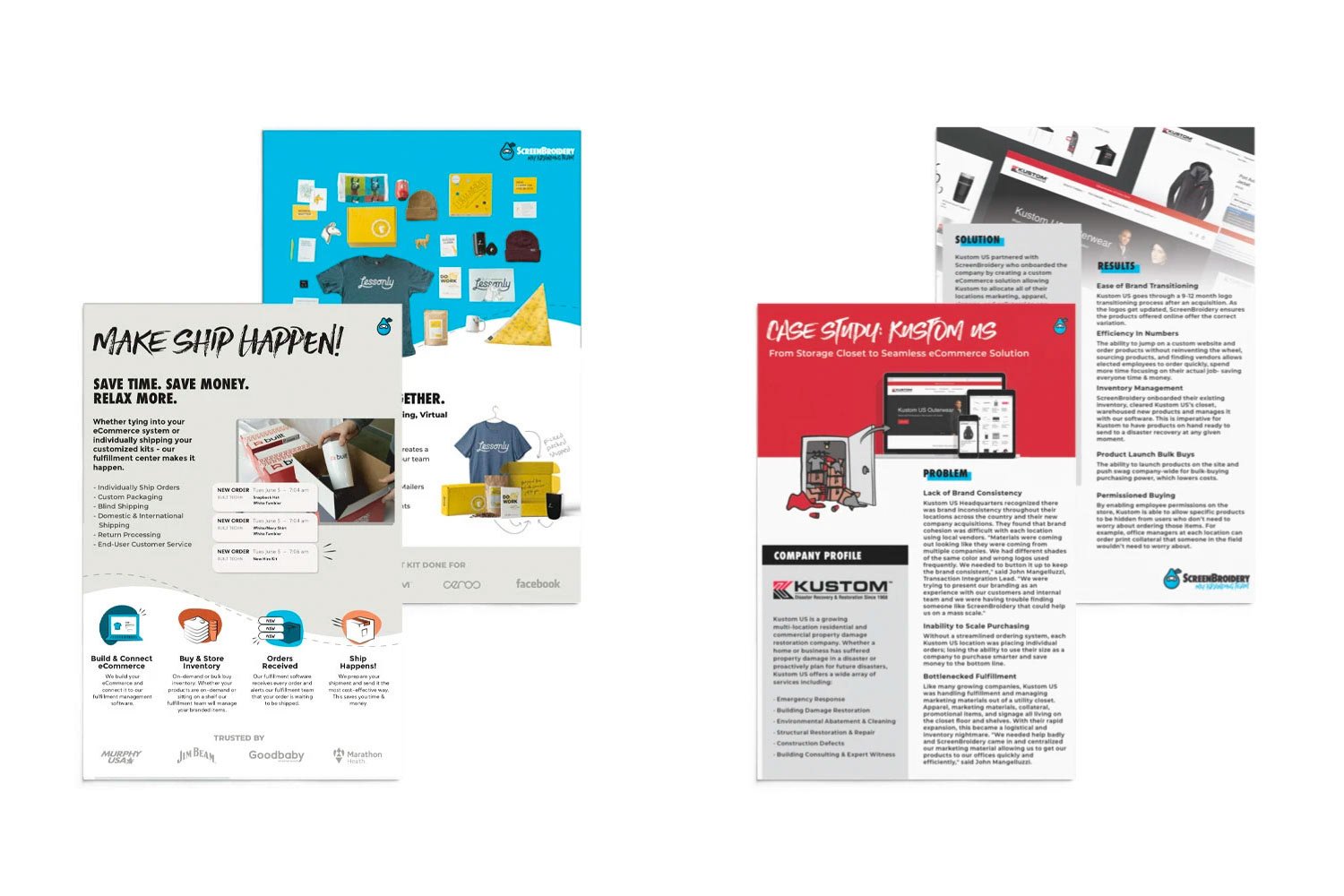
Knowledge is one of the four key values of ScreenBroidery. Naturally, with the services transitioning from brick-and-mortar maturing and growing - it became increasingly important to outline exactly what we do.
To create these services, I worked with our team on a rough outline of what we have accomplished, how we could grow, and ideas to push us to the next level. Working closely with the CEO & COO - we critiqued, refined, and finalized the services with a powerful yet simple series of statements.
Taking that info, I developed a rough vision for how this information needed to be represented visually and had our designers bring it to reality.

